• Decor & Design
  • DIY
  • Guide
  • Home Improvement
  • Smart Home
DormyHome
keep your memories alive
Home » Paints » Page 2
Category:

Paints

Benjamin Moore Silver Satin OC-26 - Paint Color Review
Paints

Benjamin Moore Silver Satin OC-26 – Paint Color Review

by Marco Bianchi August 17, 2023
written by Marco Bianchi

Do you want to look for a wall paint that is truly spectacular and out of the world? Well, an off-white neutral shade is a hue you all must be looking for. For a majestic charm and beauty, you want a color that is welcoming and brings those warm vibes into each of your rooms. By choosing a shade that exudes poshness and sophistication in an effortlessly cool manner, the entire ambiance looks stylish indeed.

The Benjamin Moore Silver Satin OC-26 is the color that is being talked about here. Choosing this shade can be absolute bliss for home decor lovers. The hue brings in a tranquil feel like none other. Homeowners discover serenity across their living spaces. The home gets a cozy and super comfortable feel while you opt to paint your wall decor using this shade. This is a shade that neither looks too dull nor does it look too bright.

Come on, let us review other intricate aspects of this lovely shade!

The Overall Features of The Benjamin Moore Silver Satin

The Overall Features of The Benjamin Moore Silver Satin

When you have an overall look at Benjamin Moore Silver Satin, the shade is a light-toned neutral that has a silvery glimmer to the paint. The shade neither looks too white nor too gloomy. The right neutral-toned shade that gives you the shimmer or silvery cascade to your walls is what gives that majestic charm and appearance to your living or drawing room spaces.

This is a shade that reflects plenty of natural sunlight, and ventilation penetrates through. The radiance of the shade with its silvery gleam can lend your property to those outstanding vibes, you know! The silver touch to your walls lends an extra dose of comfort and balancing decor to your rooms. The milky-gray hues can add fulfilling tones to the overall decor of your home spot on.

Specifications of The Benjamin Moore Silver Satin

Specifications of The Benjamin Moore Silver Satin

The Benjamin Moore Silver SatinOC-26 is a unique blend of silver and gray. This is the honest review interior home designers and home painters typically have to say. Again, if you have a more intrinsic look at it, the semantics behind each color theory with its specifications differ from color to color and from one category to another. In other words, the same shade can have different highlighting tints at various phases of the day. The Benjamin Moore Silver Satin looks off-gray during the mornings, and you get a silvery shimmer during the nights. Hence, this is a shade that is a little different from other off-whites.

There is a definite determinant that tells you how light or how dark a paint hue is. Do you know what that is? It is the LRV of the paint shade that gives you the correct precision on how much light the walls are going to reflect throughout the day. The LRV of Benjamin Moore Silver Satin OC-26 is 76.35! Here, you have a clear indication that this is a shade that falls at the lighter end of the paint palette, after all. That is primarily the reason why this beautiful satin finish hue is preferred as the shade for bases and neutrals.

On the other hand, when you look at darker shades like Red, blue, or green, here are the LRV values for each of them:

  1. Red – LRV is 227
  2. Green- the LRV stands at 226
  3. Blue- the LRV stands at 218.

In this segment, we have discussed the technical details with respect to the Benjamin Moore Satin paint tub.

How Does the Shade Feel Across Your Living Spaces?

How Does the Shade Feel Across Your Living Spaces

The Benjamin Moore Satin shade is a cozy shade that looks evenly balanced and adds to the comfort factor of your living areas. The silvery finish adds a majestic charm to your living area. As this is a shade that has a very high reflectivity value, your homes can look brighter, voluminous, and spacious too.

The shade adds depth to each of your rooms without letting it get overwhelming. This way, you build character in your living spaces. The color is an instant hit already amongst city-apartment dwellers.

Co-Relation Between Natural Lighting & the Satin Finish Paint

Co-Relation Between Natural Lighting & the Satin Finish Paint

When you allow direct sunlight to pass into each of your homes, you automatically keep your homes well-ventilated, fresh and airy. Here is where the paints of your wall decor also come into the picture. The lighter the shades of wall paints are, the more light reflective they become. In the process, lighter-toned shades or neutral colors reflect the natural light better than darker wall colors. This way, when you opt for a shade like Benjamin Moore Satin finish, you can feel rest assured that your living rooms look lighter and airier. The shimmery effect of the silver on your paint tubs gives a glowy effect to your walls during the darker hours of the day.

The deep gray undertones of the shade have, retain their color for longer decades to come unless you expose the paints to direct sunlight. Although you paint the walls facing any direction, say, north, south, east, or west, here is a word of caution you must have in mind. When you paint these shades in south-facing rooms, the rooms can feel warmer. On the other hand, when you paint this shade in north-facing rooms, you feel cooler.

Color Test of Benjamin Satin Finish Shades

Color Test of Benjamin Satin Finish Shades

Instead of applying the direct color palette, using peel-and-stick samplers would be the ideal thing to do. For less than 5 dollars, you get sampler stickers of any color paint you choose from your color palette. When you buy a sampler kit, you get two coats of the paint palette. This includes:

  1. One large peel-and-stick sampler
  2. Two mini sampler stickers

In a hassle-free manner, you can use the peel-and-stick samplers to see if this is the exact shade you are looking for. Check if the shades match the already painted areas of your wall if you are going in for a switch of color. By adding the paint samplers to your mood boards, you can further access if you would live your rooms using the hues you are planning to go in for. The process gives a real-time overview of how the new shade will look like.

Therefore, you get a conclusive idea as to whether this shade will complement the room decor also in terms of the other accessories you have placed inside your living rooms, say your coffee table, furniture sets, sofa sets, etc. This way, you commit to painting your walls with Benjamin Moore Satin finish OC -26. As an interior designer, you also recommend the shade to your clients, after all.

Choose Coordinating Hues for Benjamin Moore Silver Satin

Choose Coordinating Hues for Benjamin Moore Silver Satin

True whites blend with the Benjamin Moore gray paint tubs. To complement the decor, you choose a monochromatic palette. These shades will perfectly complement the off-white neutral you are going in for walls that have been painted using Classic Gray, a darker gray will accent the front door. You may choose a Chelsea Gray in this case. For trims and moldings, a balboa mist or pure white can be the perfect shade you are looking for.

Darker shades like blues, mauves, blacks, taupes, or even greiges go well. Accents of brushed nickel, brass, chromium, or even gold remain contrasting shades that go with Benjamin Moore Silver satin shade. Feel free to choose either a monochromatic color style or a contrasting palette. Take recommendations from home decor stylists or interior designers. Else, you use your personal preferences to gauge the room decor.

Types of Homes Where the Benjamin Moore Silver Satin Shade Goes Well

Types of Homes Where the Benjamin Moore Silver Satin Shade Goes Well

The Benjamin Moore Satin shade goes well in homes that require a warmer and more charming appeal. The color schematic goes well with traditional types of homes that have contemporary design styles, after all. Modern farmhouses also find the shade truly alluring. Transitional style cottages give a thumbs up to this silver-gray shade, as with Bohemian-styled homes too.

The neutral shades bring cool and fulfilling vibes against wall paints that are vibrant or splashy in nature. Here, you want to create an inviting or zen-kind atmosphere for those calming moments out there at home.

How Do You Use the Shade Inside Your Bedrooms?

How Do You Use the Shade Inside Your Bedrooms

Either decide to paint the walls using Benjamin Moore Silver Satin shade alone. Or, you can pair it with bold shades across accents, say, like your headboards or too. In case rooms are of compact size, then this color can be a great one for the entire decor.

Accessorize using contrasting shades. Gold, matte finishes, and crimson shades can be added to table lamps, chandeliers, dining tables, etc. For the bedrooms, you can try blending materials like cotton, wood, or velvet for the upholstery. These materials go well with the Silver paint.

Nothing can out beat the posh atmosphere kitchens have when you have the wall decor painted with off-white and gray shades. By using wooden grains for floating shelves, you add an organic modern design style to your kitchen spaces. Also, by including a backsplash and glossy white tiles, you complement the kitchen decor beautifully. Brass from a matte finish, metallic blacks, or crimson nickel is contrasting shades suited for pull handles of drawers.

Concluding Thoughts

All in all, you have seen several ways how you spruce up your living, drawing, and dining areas with the all-new Benjamin Moore Silver Satin finish. Kitchens and bedroom ideas have also been discussed with respect to this wall paint.

Analyzing the overall decor of rooms proves to be a very important consideration when you decide to choose the hues you are going to paint your walls with. Accent walls with bolder colors also lend contrasting vibes to neutral or off-white shades. The best part about the silver-gray paint is that you get two different shades at different hours of the day. The even-toned look during the day and a silvery cascade effect during the nights provide a romantic flair to your living or bedroom spaces.

Lighter shades reflect more of the natural light keeping the rooms warm, cozy and well-ventilated. For a subtle tint of the room decor, it is better you choose a wall paint color that perfectly complements the accessories and furniture pieces the room holds.

August 17, 2023 0 comments
0 FacebookTwitterPinterestEmail
Sherwin Williams Gauntlet Gray SW 7019
PaintsGuide

An Ultimate Review of Sherwin-Williams Gauntlet Gray 7019

by Tyler Hernandez August 17, 2023
written by Tyler Hernandez

Don’t you think in the vast pallet of possibilities, there is an amazing and beautiful shade of gray that is a statement of elegance and class? Yes, you heard it right. Sherwin-Williams gauntlet gray SW7019 is a captivating shade that can make people embrace any room with beauty.

This color can adapt to its surroundings, seamlessly merging with both traditions and modern aesthetics. Its rich and deep tones create a sense of depth and dimension, elevating the vibe of the room. Gauntlet gray has the power to positively affect your brain and instantly bring you to a premium place.

We have done a thorough review of this color, making sure to analyze the pros and cons before applying this shade to your room.

What Is Sherwin-Williams Gauntlet Gray?

Sherwin-Williams Gauntlet gray SW 7019 is a popular paint color with a subtle and classy feel. The beauty of this gray comes from its relation to the cool gray family having a blue undertone. This sophisticated color is preferred by many for decorating their homes. Surprisingly it’s a great color for both indoors and outdoors. Making it a great option for people looking to redo their home and don’t have enough time to spend on deciding color schemes.

Gauntlet is known for its calming and peaceful nature, creating a sense of stability and balance. People usually associate this color with a premium feel. However, the beauty of this color lies in the surroundings as well; you need to take care of the lighting to make sure it looks good. If you keep the lighting dark, then it’s sure to come out the worst experience for you.

Why Choose Gauntlet Gray?

Many interior designers are in love with this color due to its versatile shade that can be used on walls, tables, indoors, outdoors, and everywhere you can think of.

So, here we have curated a few reasons why you should opt for gauntlet gray for your next project.

1. Classic & Timeless

Classic & Timeless

Gauntlet Gray is a classic and timeless color that has been popular for decades. It has a beautiful subtle warmth that magically adds depth and dimensions to any space. The amazing part is it can be paired with a wide variety of colors and lighting tones.

2. Neutral Yet Bold

 Neutral Yet Bold

While it is a neutral color, it still has enough depth and intensity to make a statement. It is a bold color choice that can add drama to your room without being too cliche or dramatic.

3. Complements Other Colors

Complements Other Colors

Sherwin-Williams gauntlet gray SW 7019 is an amazing base color that compliments other shades. It goes well with shades like crisp white, creams, and even deep blue and greens. Gauntlet gray even works well with a variety of designs and styles, so what’s stopping you from trying it?

Understanding the Color Psychology of Gauntlet Gray

Understanding the Color Psychology of Gauntlet Gray

Colors have a great impact on our mood and behavior, and hence it becomes really important to choose the right colors for our home. Before we choose any color for our homes and living spaces, we must understand what kind of impact they will have on us. If we talk about the Sherwin-Williams gauntlet gray SW 7019, it is a color that evokes calmness and tranquility. It’s a shade of gray with a hint of blue, making it the perfect shade for your bedroom and even bathrooms, where relaxation is the key.

Gray is a shade that is associated with intelligence, balance, and association, and hence you will find many business people wearing gray suits or coats. Hence if you choose to have Gauntlet gray at your home, it could have a great impact on your personality and mood whenever you come back home.

Complementary Colors with Gauntlet Gray

No doubt, gauntlet gray is a versatile color, so the list of complementary colors could go long, but we have selected the best combinations for you so you don’t have to go through the struggle of mixing and matching.

Have a look.

1. Navy Blue

Navy Blue

The cool undertone of navy blue contrasts beautifully with warm tones of gauntlet gray, creating a balanced and timeless look.

2. Pale Pink

Pale Pink

Pairing the gauntlet Gray with pale pink creates a sophisticated and feminine feel. The softness of pink offsets the darker tones of the gray, resulting in a beautifully harmonious and calming effect.

3. Mustard Yellow

Mustard Yellow

The warmth of mustard yellow works pretty well with the warm tones of gauntlet gray. This killer combination can create a very welcoming and inviting atmosphere. These shades can bring a great vibe to your living space.

4. Olive Green

Olive Green

This earthy green color pairs perfectly with the natural and grounding tone of gauntlet gray. This could result in a very calming and serene vibe; make sure you utilize this combination for a space where relaxation is your goal.

Pros & Cons of Sherwin-Williams Gauntlet Gray

Like all paints, gauntlet gray also has its pros and cons. Check out the lists to get more clarity before choosing the shade.

Pros

  • Gauntlet gray is a shade that can be used in a variety of ways, indoors or outdoors. You can use it to create an accent wall, a bathroom or bedroom, and whatever comes to your creative mind.
  • It is a very calming and relaxing color that will help you create a relaxing and productive environment. Hence this color could be used in bedrooms and even office spaces.
  • As mentioned above, it is a very neutral color that can be paired with a variety of shades, creating different vibes. Combining it with shades of cream creates a very luxurious kind of effect.
  • Gauntlet Gray is a pretty durable color that can easily withstand wear and tear. Making it a great choice for areas such as bathrooms and even cafes or high-traffic areas.
  • Finally, it’s a low-maintenance shade. You will not have to stress about cleaning as it’s already dark and hence easy to clean. Busy people, that’s a great one for you.

Cons

  • Gauntlet gray is a pretty dark color so it can be a dark shade for some people. However, you can always lighten it by combining it with lighter shades such as white, cream, or baby pink.
  • For people who are very vibrant in personality, gauntlet gray is a very neutral color, and they consider it boring. So, if you want to add this shade to your space, make sure to do your research and pair it with vibrant things that make your personality.
  • It may be difficult to find the exact gauntlet gray shade. It comes in various shades, and choosing the best one from it is a real challenge. This is where most people just give up.
  • It is a very premium paint color and hence is very expensive, as compared to most paints available in the market. But remember, it also has a quality that no other paint provides.
  • Gauntlet gray is a dark shade, so it can be difficult to apply evenly and sometimes can get darker if you apply too many coats just to match the shade. Make sure you paint carefully whenever using gauntlet gray.

Conclusion

All in all, sherwin-williams gauntlet gray SW7019 is a stunning color option that will help to enhance the appearance of any space. It is a preferred option for homeowners due to its adaptability and capacity to be combined with various shades. According to color psychology, Gauntlet gray is a very intelligent and sophisticated color that depicts class and elegance.

Make sure to test this color in various lighting and various shades to make sure your house has the best combination. The drawback could be a dark room overall, so checking the lighting is a must.

Frequently Asked Questions

What is the Undertone of Gauntlet Gray?

Gauntlet gray is a sophisticated and string color with a versatile undertone. It has a subtle warmth that adds a premium feel to any space it is applied to. The undertone strikes a perfect balance of peace and tranquility.

What Colors Go Well with Gauntlet Gray?

It can be paired with a variety of colors, creating amazing combinations. For a sophisticated and classy look, pair it with tones of white or cream. To add depth, pair it with deep blue and green.

Is Gauntlet Gray a Warm or Cool Color?

Gauntlet gray leans towards being a warm shade of grey. It has a subtle hint of warmth in its undertone. However, it even has a pinch of cool touch to it, and that’s the reason that makes it such a b beautiful color to op for.

What Is Gauntlet Gray’s LRV?

Gauntlet Gray’s LRV stands a bit over 17, placing it in the medium-dark category, Which simply means it’s a color that is neither too dark nor too light, which makes it a perfect fit to create your dream home.

August 17, 2023 0 comments
0 FacebookTwitterPinterestEmail
17 Ideas to Style to a Small Bathroom
BathroomPaints

17 Ideas for Styling and Paint Color for Small Bathroom

by Freja Johansson August 17, 2023
written by Freja Johansson

Are you on the lookout for some inspiration for your small bathroom, which will transform the space into a luxurious spot to relax? Fortunately, you are not alone in this quest. These days most apartments come with small bathrooms with limited natural light and a lack of storage spaces.

All this makes decorating a small bathroom quite a challenge. But what if you were told that the right choice of accessories, storage, and paint color for your small bathroom can make it seem totally different and even spacious? Yes, you could do that with the right choice of decor.

The ideas listed below are proof that bold interior designs can be pulled off in the tiniest of spaces.

So what are you waiting for? Scroll down and have a look yourself!

Best Ideas to Style to a Small Bathroom

Here are 17 ideas listed below to style your small bathroom.

1. Wall-Mounted Cabinets to Maximise Storage

Wall-Mounted Cabinets to Maximise Storage

Storage is an important aspect of any functional bathroom. Multiple utilities need to be stored inside the bathroom, such as extra towels, skin, and hair care, other toiletries, sanitary supplies, etc. Space is a limiting factor when decorating a small bathroom. There is not much floor space, to begin with. But stuff still needs to be stored. Wall-mounted cabinets are a good alternative for floor-based storage options. Find a convenient spot for setting the cabinet so that it does not come in the way of easy movement. If you have a horizontally long bathroom, then mount the cabinet on the vertical or smaller walls.

2. Get a Large Vanity

Get a Large Vanity

Opting for a large vanity inside a small bathroom may seem like a bad move, but here is the thing- storage is an issue in a room of limited size, and thus if you are placing a larger-than-usual vanity, all your storage issues are being met with that one installment. Moreover, you will be getting a lot of counter space as well as a focal point for the bathroom.

3. Go For a Minimalist or Modern Decor

Go For a Minimalist or Modern Decor

Consistency is the key to any home decor idea, but this is especially true for small spaces like a bathroom that has less square footage. In such a space, you must choose a decor style that looks compact and neat. Modern or contemporary decor styles are good options as those prioritize minimalism and decluttering. The key to this is consistency, as you cannot add too many items to the place. If you want a minimalist look, then go for natural or metal accents and a muted paint color for a small bathroom area. Choose accessories that complement the decor.

4. Install LED Lights

Install LED Lights

Good lights can change the whole look and vibe of a place. Use LED lights to amp up the decor of your bathroom. You can install multiple types of lighting and layer them up according to your choice. Use bright white spotlight LEDs to illuminate corners so that the space looks more open up. A mellow layer of a warm yellow LED or wall sconces is also a good idea. You can consider hanging lights as well. This light will be enough for visibility but will also not be bright enough to disturb your comfort. The same effect can also be achieved by corner mood lights.

5. Build an Accent Wall

Build an Accent Wall

Accent walls in a small space can create an illusion of a bigger space and also give you a chance to express your unique taste through the decor style. Moreover, it is also a good option on a budget as you are updating only one wall. Tile is a well-loved material for bathroom spaces, and you can never go wrong with a tile wall. If you have chosen a neutral paint color for the small bathroom, then go for a bold color for the accent wall. A neutral tile wall will look good with a deep-colored general decor.

6. Strategic Mirror Placing

 Strategic Mirror Placing

Mirrors are a must in every bathroom. And thankfully, reflective surfaces like mirrors create an illusion of a large space. Therefore strategically place the mirror to face a window that receives direct sunlight or some good lights for the most brightly illuminated bathroom. If you want your bathroom to look trendy and elegant while also being functional, then consider a statement mirror that occupies the central location in the room. A statement mirror usually takes up a whole wall, but if you do not want that, then a plain rectangular mirror should do it.

7. Build a Shower Over Tub to Save More Space

 Build a Shower Over Tub to Save More Space

Every homeowner has probably wondered at some point whether they should get a shower or bathtub for their bathroom. Each has its own merits and demerits, but why not look at the bigger picture and squeeze in both inside your bathroom? You must be wondering, how is a small bathroom space supposed to accommodate the two? Well, if your bathroom layout has been constructed with a square shape, then a bathtub can easily fit in. And the shower head goes above the tub, so you get inside the tub and take a shower or just lay down and enjoy a bath. Imagine how much space you will be saving!

8. Utilise the Corners

Utilise the Corners

So much space is wasted in the corners because we do not pay much attention to it or just do not have the appropriate means to make use of the available space. But you are not going to do that. Install corner shelves or a corner cabinet inside your bathroom that can supplement the vanity or other shelves in terms of storage. Stuff that need not be placed in the open can be stored there. These may include extra towels, extra slippers, and even bathroom cleaning supplies.

9. Go for a Wet Room Flooring

Go for a Wet Room Flooring

When space is a constraint, it is okay to think outside the box and design a space that can be utilized to its fullest without a bit of clutter. Instead of adding bulky bathtubs or a space-consuming shower cubicle, you can simply opt for a wet room. This allows the full usage of the available space without being inconvenient or any less functional. However, you might not like the idea of a wet bathroom floor. In that case, consider installing a dividing shower curtain or a glass panel around the showering area.

10. Get Some Cove Lights

 Get Some Cove Lights

Have you ever been to a luxury spa and noticed their lighting that does not stare at you in the face but still has an intimate and warm glow? Yeah, those are cove lights in all probabilities. And if you are looking for ways to add some fancy accessories to your ensuite bathroom, then these are perfect for you. You can never go wrong with cover lighting. The best thing about these lights is that they are hidden behind mirrors and false ceilings, so it illuminates just enough to create a comfortable atmosphere.

11. LED Lights Around the Mirror

LED Lights Around the Mirror

Adding a mirror can add dimension to a small space, especially if there are a lot of lights reflecting off of the mirror. It essentially widens the place and creates a sort of illusion in which the place seems bigger. You can add to this by adding more light around the mirror. LED lights go best as they come in all shapes and sizes and can be bought according to the decor. Besides, if there is no natural lighting available, white paint color for the small bathroom, along with mirror lights, will create a very elegant and vibrant decor for the space.

12. Wallpaper for Accents

Wallpaper for Accents

A wallpaper is a simple and cost-effective way to remodel your bathroom space. A tiled accent wall surely looks great; sometimes, we just have to achieve great things on a budget. And that is why you should be looking into getting waterproof wallpaper to create an accent wall in your bathroom. Build a shower wall out of this and make a unique focal space for the room. The best part about this is it is not permanent and can be removed and remodeled whenever you feel like it.

13. Consider Moroccan Tiling

Consider Moroccan Tiling

While we are on the topic of creating an accent wall in small bathroom spaces, we should discuss the well-loved Moroccan Tiling. These are hard to miss because of their intricate designs and bright colors. Moreover, these tiles are quite popular in bathroom decor. However, it is a matter of taste, as not all people like such bold patterns on their walls. You can still go with this option for one accent wall, and if you like it, then go all it and cover all the walls with Moroccan tiles to create a unique bathroom.

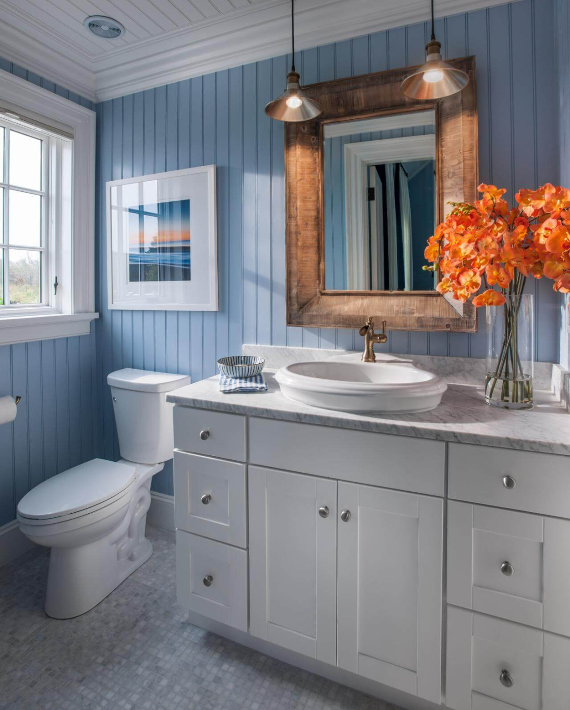
14. Create a Relaxing Blue & White Color Scheme

 Create a Relaxing Blue & White Color Scheme

Calm and muted colors can bring peace to the mind, and this is scientifically proven. This is probably why so many people use lighter colors, such as neutral shades of blue or green, for their bathroom, where they would like to relax. The color paint for your small bathroom determines one of the most important things in the decor, and that is the atmosphere you want. Get a neutral shade of blue to color the walls of your bathroom mixed in some white. This color scheme will add dimension to your small bathroom and open up the place, making it seem large. It will also preserve a fresh and enlivening atmosphere in the room.

15. Go Bold with Colors

Go Bold with Colors

If you are not a fan of a bathroom with muted colors, then there is always the option to opt for bold colors. It is true that white has quite the popularity when it comes to making small spaces feel large. But what if you could just accept the available space and give it the best decor? You can do so by making some bold choices in terms of color. Deep blue, teal, or fuchsia combined with white accessories and accents of copper or gold is a very classy combination. And with that, you need some warm yellow lighting to create a bathroom space that is unique and has character.

16. Reflective Glossy Tiles

Reflective Glossy Tiles

If the space in your bathroom feels cramped up, then adding good lighting is the way to go. But that is not all. You need reflective surfaces that will help the light from the fixtures to shine out properly. Consider upgrading the walls with glossy tiling. The bathroom is one of the very few spots where a glossy tiled wall will not look odd. Plus, it will also add a dramatic element to your bathroom with tiles that reflect the lights and create interesting depth and dimension to the walls. This will be more of a statement than plain tiles and will also be a decor element that stands out in your house.

17. Color Scheme with The Primary Brights

Color Scheme with The Primary Brights

The primary colors are red, blue, green, and yellow. It will be quite fun to build a color scheme out of these colors, don’t you think? Choose three colors for three focal spots in your bathroom, such as the wall, the vanity, and the tub. The remaining primary color can be added in accents and accessories. But you have to commit to this color scheme and refrain from adding anything that looks out of place.

Wrapping Up

All in all, consistency is key when planning decor for any space at all, be it small or large. This is especially true for smaller spaces like a bathroom, as if you do not plan the interior carefully, the space may get quickly occupied by the necessary bathroom objects. That is why choose any one style of decor and incorporate it in the most creative ways possible. After all, bold design elements can be added to tiny spaces as well.

The usual elements that go into the bathroom decor of average size have to be tweaked and modified for a smaller space, and that is what makes this task so interesting.

Just remember that the bathroom is part of a whole and, thus, should not be out of place with the general home decor.

August 17, 2023 0 comments
0 FacebookTwitterPinterestEmail
11 Stunning Paint Color Combinations for Your Kid's Room
Paints

11 Stunning Paint Color Combinations for Your Kid’s Room

by Marco Bianchi August 17, 2023
written by Marco Bianchi

Whether you talk about a kid or an adult, painting colors on the wall is an activity that excites everyone. You always like to paint colors that match your personality, mood, and even your well-being. However, according to a study done by California, kids are a little more sensitive about the colors in the room than adults.

The main challenge parents experience when choosing the color for their children’s room is that their tastes vary greatly from those of their children. Parents like the same colors in milder, calming shades, while children choose brighter and shining colors. If you’re going through a similar situation and feel like some advice and recommendations, then here you go.

You’ll be happy to know that we’ve gathered the top 11 paint colors for you to choose from and create the perfect room for your child!

1. Sage Green

Sage Green

Light green, in addition to being a cheerful and relaxed color, also aids in comfort and soothes the environment. If your child wants to create a forest-themed or adventurous atmosphere in his or her room, this paint color is the greatest option.

Along with producing beauty, it also generates a sensation of freshness and life. Additionally, sage green is influenced by the natural world, bringing the beauty of the outside indoors. Introducing the space with a hint of the serenity of nature, it mimics the shade of recently fallen leaves and greenery. Sage green is one of the soothing Paint colors that connect kids to nature and promotes peace and harmony. Use it in your kid’s bedroom to get this effect.

2. Warm Beige and Greys

Warm Beige and Greys

These colors are a great choice for siblings of different gender who share the same bedroom. With its warm and calm property, it provides positivity and a sense of contentment.

Warm beige and greys offer a calming and elegant backdrop that may be easily complimented with flashes of color or metallic highlights, whether they are utilized as wall paint or incorporated through furniture and accessories. Your home will continue to seem fashionable and welcoming for many years to come, thanks to this classic color scheme.

3. Faded Lavender

Faded Lavender

Lavender color generally considered a gender-neutral color. However, the shade of little pink is popular with girls’ children. These powdery tones can create a more serene environment compared to a darker, more intense purple. If your kid wants an uncommon yet known paint color in his/her bedroom, you can always go for faded lavender.

Children often need a space where they can unwind, relax, and recharge, and this paint color, lavender, provides just that. Its gentle and muted tone creates a tranquil environment, promoting a sense of peace and tranquillity that can be beneficial for a child’s sleep patterns and overall well-being.

4. Sky Blue

 Sky Blue

Youngsters enjoy colors that are vivid and bright, and blue has an upbeat appeal that makes for a fun setting for youngsters. In addition to being gender-neutral, it is more common among boys. To make it appear more serene, you can always blend it with other paint colors like grey, mild orange, etc. As you can see in the sky, sky blue also looks fantastic with white. Thus, most parents choose this combination for their children’s rooms to give them a more earthy and natural appearance.

Sky blue color, with its soft and cheery shade, always make the influence of a light environment that can make the space feel joyful and happy. Kids like this color for its soothing appearance and gentle appeal.

5. Sunny Yellow

Sunny Yellow

Yellow is a great paint color for kids’ rooms since it is frequently linked to joy, vitality, and enthusiasm. A sunny day’s warmth and vigor are emitted by sunny yellow in particular, which illuminates a bright and sunny mood. It has the power to rapidly improve a person’s mood and create a spirit of enthusiasm, which is especially advantageous for kids who develop in an environment that is brimming with good vibes.

Many interior designers recommend using some other paint colors as well while painting kids’ spaces with yellow color; it is also suggested to use lighter shades of colors to get a relaxing ambiance. Rugs, bedspreads, pillowcases, and lampshades are all suitable options. An excellent color choice for your baby’s room is yellow because it is unisex.

6. Tangerine Orange

Tangerine Orange

Bright orange is a lovely color to use in a child’s room as it creates a sense of high energy and positivity in the kids’ thinking. However, most designers would advise you not to use bright orange colors in your kids’ room as it may affect their quality of sleep.

Then, how can you tackle this problem? Well, if you want to use this color or your children like it, then you can always go for the lighter shades of orange, and you can also choose different paint colors to be used with orange as well. A lively orange bedspread will pop against grey walls and/or beside a grey rug. A vibrant poster or other wall hanging will work great to add a touch of additional orange.

7. Cool White

Cool White

The cool white paint color is frequently considered by parents to be dull and boring for a child’s room, but trust me, it is just as vibrant as any other shade you might have come across. White color, when blending in with some other paint colors, can be a most elegant and stylish color that creates a soothing and calming impression in your kid’s space. The most underrated benefit that we would like to mention here is that your child will never get bored with this paint color as they can always style it the way they want with their changing preferences as they become older.

Utilizing cool white in your area has the additional benefit of allowing you to decorate it with any other color and accent. Therefore, regardless of how your children’s tastes change as they get older, they may always decorate their room any way they like without worrying about the color of the walls. Utilizing the upper wall and ceiling makes the room appear lighter and promotes an airy, tranquil environment.

8. Beige

 Beige

It’s always a good idea to pick a simple, light shade for the kids’ room that will grow with them, and one of the greatest alternatives is beige. Beige is a versatile neutral paint color that blends effortlessly into both traditional and modern decor and endures the test of time.

It provides a serene backdrop against which different colors and designs can stand out, making it simple to change as your child’s preferences and hobbies change over time. Whether you want to create a playful and vibrant space or a more serene and sophisticated atmosphere, beige acts as a reliable base color that harmonizes effortlessly with a variety of other shades.

9. Peach

Peach

When selecting the paint color for your children’s room, peach may not be the first color that comes to mind, but it can still be a wise decision for a variety of reasons. Peaches are a wonderful tint with flavors of orange, pink, and beige. It is a light color that contributes to the kids’ room being a comfortable and welcoming place.

The gender-neutral nature of peach makes it a good choice for a children’s room as well. Boys and girls both appreciate this hospitable color, making it a versatile option that suits a range of interests and inclinations. It provides a healthy, welcoming environment where your child can feel at ease and exhibit their uniqueness.

10. Coral

Coral

The main distinction between coral and peach is that coral is closer to pink while peach is more like orange. Coral and peach are generally thought of as being quite similar in color. Bright coral can be styled with other paint colors, like white and light grey, to make it warmer and more inviting. Coral looks well in many different types of design, from tropical and seaside themes to more diverse and surreal looks.

Furthermore, coral has a versatile nature that works well for both boys’ and girls’ rooms. Its warm undertones add a touch of energy and vitality without being overly feminine or masculine. Whether used as a dominant color or as an accent, coral can be incorporated in different ways to suit your child’s personality and preferences.

11. Cardinal Red

Cardinal Red

It’s great to take on the challenge of designing a colorful and motivating atmosphere for your child’s bedroom. Cardinal red is a great alternative if you’re trying to decide on the ideal paint color. A plain space can become a compelling retreat for your child when painted in this strong and vivacious shade. The power of cardinal red to excite and stimulate is one of its main benefits.

The lively quality of this shade gives the space a sense of vibrancy and immediately gives it a cheery atmosphere. Imagine your child having a rush of energy every morning, eager to face the day in their brilliant red surroundings. Cardinal red has energetic effects, but it can also inspire your child’s imagination and creativity.

Conclusion

All in all, despite the fact that the ideal paint color for your child’s room depends on a variety of aspects, including age, gender, taste, and personality, we have compiled a list of the most calming yet vibrant colors so that your family may sit down and decide on the ideal paint color for your child’s room.

Everyone as a parent wants the best for their children; in today’s market, where you can find multiple options for any item, it’s also necessary to choose what is best for ourselves.

Its always important to consider your child’s preferences while selecting a paint color for their room; whether you opt for a soft and calming space or you like a shiny and bursty theme, the key is to make a space according to your kid’s personality.

Choose the best paint colors from the above options and make your kids fall in love with their space.

August 17, 2023 0 comments
0 FacebookTwitterPinterestEmail
A Complete Guide on Benjamin Moore Wickham Gray
GuidePaints

A Complete Guide on Benjamin Moore Wickham Gray

by Tyler Hernandez August 17, 2023
written by Tyler Hernandez

Benjamin Moore Wickham gray is undeniably a stylish choice for gray paint color, but its coolness can turn icy when exposed to North facing light. To illustrate, consider comparing Wickham gray and classic gray on a wall devoid of direct natural light.

Benjamin Moore Wickham Gray belongs to the esteemed historic color collection, which showcases a comprehensive range of 191 revered hues, making it our most sought-after palette. These refined and elegant colors from the historical collection provide a timeless aesthetic suitable for traditional and contemporary environments.

To create an open and airy ambiance throughout our house, you should have a fondness for incorporating light gray paint colors. This allows you to establish a neutral foundation and subsequently introduce vibrant elements for adding visual interest. This approach offers the advantage of easy and cost-effective customization, as you can effortlessly swap colorful pieces if you ever desire a change. However, selecting the perfect gray color is undoubtedly a challenging task.

Details and Specifications of Benjamin Moore Wickham Gray

Details and Specifications of Benjamin Moore Wickham Gray

To truly understand the worth of color, the key lies in getting into the specific details and specifications of Benjamin Moore Wickham Gray. Therefore it is essential to familiarize yourself with the fundamental theories and facts before deciding to select the paint color for your home.

Firstly, you must understand the concept of light reflection value, i.e., LRV, which serves as a measurement unit of lightness and darkness of paint color. In the case of Benjamin Moore Wickham Gray, the LRV is recorded at 68.94, which provides valuable insight into its light-reflecting properties.

Undertones of Benjamin Moore Wickham Gray

Undertones of Benjamin Moore Wickham Gray

Benjamin Moore Wickham Gray gives a captivating undertone by combining hints of both blue and green. This characteristic adds an extra layer to the paint color by setting it apart from grays that possess a singular undertone, such as blue or purple.

It is important to understand the significance of undertones when you’re going to select a paint color. By recognizing that Benjamin Moore Wickham Gray is a lighter-toned gray with a green-blue undergone, you can explore alternative options in light blue-gray shades.

Coordinating Colors with Benjamin Moore Wickham Gray

Coordinating Colors with Benjamin Moore Wickham Gray

To fully appreciate the beauty of Benjamin Moore Wickham Gray, it is crucial to find its pair with care and creativity. This involves selecting complementary color schemes that harmonize seamlessly with this soothing shade. Consider pairing Benjamin Moore Wickham Gray with crisp whites.

Dark sage green and lighter beiges serve as excellent choices to complement this paint color. To add a touch of sophistication, metallic accents like black, gold, and brass can be incorporated into the design scheme.

Moreover, the choice between a monochromatic or contrasting color palette can be made based on the interior design style and personal preference allowing for further customization and visual impact.

Test Your Color of Benjamin Moore Wickham Gray

Test Your Color of Benjamin Moore Wickham Gray

To make sure of the correct color selection, it is essential to experiment with multiple shades of your desired colors. Begin by collecting various shades of gray with blue undertones, and then consider adding it with green or even purple.

In order to determine the most suitable colors for your space, it is necessary to compare them with other colors too. This approach will help you in the easy identification of undertones and helps in determining which shade is preferable, whether lighter or darker.

Follow some instructions to test your wall colors accurately. Paint a large square of the desired color on a white poster board, leaving a white border, or opt for ordering peel-and-stick samples for your convenience. Peel-and-stick samples are generally recommended for their simplicity.

Which Color Works with Benjamin Moore Wickham Gray?

Which Color Works with Benjamin Moore Wickham Gray

Certain shades of gray do not complement different shades of white, but that is not the case with Wickham gray. This color is more versatile and harmonizes beautifully with whites and true whites. Examples of true whites are Oxford White and High Reflective White. These colors are devoid of undertones and are particularly recommended for creating a striking contrast between your trim color and wall color.

For a gentler and more subdued aesthetic, the combination of Wickham Gray with a creamy off-white like Cloud white or Dove white is highly appreciated.

Compare Benjamin Moore Wickham Gray with Other Colors

Compare Benjamin Moore Wickham Gray with Other Colors

If Wickham Gray is on your list, chances are that you are considering other gray paint colors. It is beneficial to contrast the paint color, which is under review, with other popular options within the same color family. The comparison proves to be valuable when faced with the situation of deciding between two closely related and popular shades.

1. Sea Salt, in Comparison to Wickham Gray

Sea Salt, in Comparison to Wickham Gray

Where Wickham Gray exhibits blue-green undertones, Sea-salt inclines towards a blue-green hue with a significant amount of gray mixed in. Sea salt color undeniably possesses its own distinct color identity.

The comparison between the two also emphasizes the substantial gray undertones in Wickham Gray. Thus, when discussing the green and blue undertones, a direct comparison with a true green-blue shade like sea salt reveals the neutrality of the color.

2. Gray Owl Comparison

Gray Owl Comparison

Gray owl, a highly sought-after gray paint color from Benjamin Moore, shares similarities with Wickham Gray as both of these exhibit blue and green undertones. However, when directly comparing the Gray owl to Wickham Gray, the former appears closer to a genuine shade of gray.

Despite sharing the same undertones, Wickham gray contains a more prominent presence of blue and green compared to Gray owls. It possesses a distinct and almost stormy quality while still maintaining a relatively light appearance. Interestingly, both have similar Light Reflection Values (LRV), resulting in comparable depths. Consequently, neither of the shade appears lighter or darker than the other when observed side by side.

3. Classic Gray Comparison

 Classic Gray Comparison

Benjamin Moore’s Classic Gray encompasses a significant amount of gray while occasionally leaning towards beige. This warm hue exhibits a neutral appearance but doesn’t quite achieve the effect of pure white paint color.

Compared to Wickham Gray, Classic Gray is slightly lighter and inclines more towards an off-white shade. It is an excellent choice if you desire a color that effortlessly complements various elements. It enhances its versatility as well as carries a warm undertone.

4. Horizon Shade Comparison

 Horizon Shade Comparison

Horizon is a gentle hue that inclines towards gray and is an off-white paint color from Benjamin Moore. Like Wickham Gray, Horizon also exhibits blue and green undertones. It is a lighter version of Wickham Gray. The overall similarity between the two is apparent, and also it contains slightly less blue than the latter shade. Both colors evoke a chilly, icy aesthetic, emanating a similar visual impression.

Where You Can Use Benjamin Moore Wickham Gray?

Where You Can Use Benjamin Moore Wickham Gray

No matter the space, whether it is the home office, living room, bedroom, or kitchen, this paint color is suitable for all the areas of your home. You should use this color in your home because this color exudes a sense of positivity and makes it an excellent choice for fostering a healthy mindset. When considering design style, this color complements coastal, Caribbean, and modern interior design styles exceptionally well.

1. Living Room & Dining Room

Living Room & Dining Room

This color is an ever-reliable choice that will never disappoint. If you desire a cool and lay-back ambiance in your room, you could consider this color seriously. As this color doesn’t exude a warm and cozy vibe on its own, you can introduce a warm off-white shade on the opposite wall to create a harmonious balance in the overall appearance. When it comes to a fireplace, you can opt for white bricks, which add a charming and rustic touch. As far as furniture is concerned, go for something with a natural wood base. This combination offers a timeless and elegant look and also complements the overall design scheme.

2. Bedroom

Bedroom

Consider painting all the walls in this Benjamin Moore Wickham Gray for an immersive and blissful experience. For your bedroom, you can either go for a natural theme incorporating jute and seagrass elements or choose curtains, rugs, and throw pillows of off-white colors, to maintain a cohesive look. To create a striking contrast against the main color and add visual interest to your space, you can consider including shades of gray and yellow-green.

For the exterior of your home, this color can be applied to the walls using whites, moldings, and special architectural features. If you want to add a captivating contrast, you can add blue colors to the doors and windows. Such bold choices will make them stand out and add a striking visual element to the overall exterior design.

Summing it Up

All in all, Benjamin Moore Wickham Gray color, which is discussed throughout, offers a versatile and pleasing option for various spaces in your home. With its cool and lay-back appeal, it is perfectly suitable for creating a calming atmosphere in the living room or a sea-facing bedroom.

To make the color scheme look even better, you can use materials that can add a touch of elegance and make everything more stylish. You should also consider using natural materials, which will help create the desired atmosphere and make the space feel even more inviting and cozy. Not limited to the interiors, this can also be applied to the exterior walls of your home.

This color choice offers a sense of tranquility, elegance, and versatility, making it a reliable and timeless option for transforming your living spaces into havens of style and serenity.

Frequently Asked Questions

What Are the Undertones of Wickham Gray?

Undertones of Wickham gray are predominantly blue and green. It gives a cool and serene sense of the surrounding. These undertones contribute to its distinctive appearance and create a feeling of calmness and a hint of freshness.

What Are the Best Colors for Combining with Wickham Gray?

It pairs well with a variety of colors, like creamy white, warm off-white, and shades of beige, to create a harmonious and neutral palette. Soft blue and green can also be used as a combination. The best color combination will depend on personal preference and the desired mood or style of the space.

What Is the Difference Between Wickham Gray and Stonington Gray?

Wickham Gray is a light gray with blue and green undertones that gives a cool and refreshing appearance, whereas Stonington Gray is a medium-toned gray with a hint of blue undertone and provides a more neutral and balanced look.

Are There Any Colors than White that Can Be a Good Combination with Wickham Gray?

Yes, there are colors that can go with Wickham Gray, which are not whites. Soft blues or soft greens, or even light yellow, are some of the colors that you can pair with gray tones without any hesitation. These are the colors that can give you the feeling of calmness in your space. There are various options in colors you can explore to pair with gray.

How Can I Make My Kitchen Space Look Warm with Wickham Gray?

To create a warm ambiance in your kitchen, consider you can go for warm-toned accent materials and natural wood elements, like cabinets, countertops, or flooring of colors like honey oak or walnut. You can also use warm metallic finishes like brass or copper for fixtures and hardware. Other than these options, you can opt for warm lighting, like soft pendant lights or under-cabinet lighting, to enhance the cozy atmosphere.

August 17, 2023 0 comments
0 FacebookTwitterPinterestEmail
Comparing Agreeable Gray to Similar Popular Shades
Paints

The Ultimate Comparison: Repose Gray vs Agreeable Gray 

by Tyler Hernandez August 17, 2023
written by Tyler Hernandez

Who else doesn’t want their walls to look great, especially when the trends ask for some aesthetic vibes? Gone are the days when people used to have colorful walls and decorative art. The pattern has changed to one that is more straightforward and minimalistic in appearance. To deal with this, the colors people choose are generally off-white and sometimes shades of gray. One of those colors is Agreeable Gray by Sherwin Williams.

But most people generally get confused with the Agreeable gray with different other shades. Since Agreeable gray is a hype in the market and many similar shades are all around, there are chances of which one to choose.

To deal with this confusion, here is a comparison for your understanding and comfort while choosing which is the best for you.

1. Agreeable Gray vs. Repose Gray

Comparing Repose gray with Agreeable gray is something quite difficult; where you see, these two are considered to be one of the perfect grays in the market. Undoubtedly, they both fall under the top 10 greige-taupe range, with Agreeable Securing at 4th and Repose at 8th. They both have been found among the famous and loved shades right now. But, when choosing, you would look for the better one.

Agreeable Gray vs. Repose Gray

If you ask many experts, they will agree on what the name is Agreeable gray shade because of the following points-

  1. The repose gray has an LRV of 58, whereas Agreeable stands at 60; this makes Agreeble feel lighter in touch and has a subtle shift in depth.
  2. Agreeable has good coordination with the interior works as it looks subtle and has a warmer tone than Repose.
  3. However, both can catch violet or a green hue; Agreeable stands ahead with its far vaguer in terms of undertones.
  4. Despite being both warm neutrals, Agreeable stands more trendy when compared to Repose in terms of more warmness which enhances its quality to touch, feel and see.
  5. Although Agreeable is good, that doesn’t mean that repose is not worthy. But, Agreeable is more of a flexible and reliable shade of gray. However, if you have already applied for Repose Gray, you should never worry because it is also a very lovely and beautiful color. If you are planning to apply Agreeable with pre-applied repose, it is also a viable option.

Also, if you are getting confused between both of them, then obviously, Agreeable is more of a big yes whenever asked.

2. Agreeable Gray vs. Accessible Beige

The next shade, Accessible Beige, has a feature of turning to gray from beige, whereas the Agreeable Gray shows more of a gray shade. This means that you generally end up seeing gray shades in AG, but AB is more of a dual toning making it more subtle and trendy.

Compared to, Agreeable, the accessible beige color stands at 18th but still gives the Agreeable gray tough competition. Since the trends are shifting, we need to identify the differences between both of them to answer which one is better for you.

Agreeable Gray vs. Accessible Beige

  1. Similar to Repose, the Accessible Beige also has an LRV of 58, and obviously, the Agreeable has 60, which means; accessible is more on the darker tone.
  2. Since accessible stands at 18th in the Greige-Taupe, it has more gray in it.
  3. If you have a North-Facing room, accessible beige is good to go where you can balance the cool light and make the room look and feel neutral.
  4. They both have equally subtle undertones, where Agreeable Gray grabs Violet and Green, and Accessible Beige can grab slightly orange and rarely green.
  5. The trend following in deciding the colors for interior and exterior finishing makes you fall into a dicey situation where it is tough to decide which one’s better.
  6. But, the most popular falls to be the Agreeable, with its flexibility and more of a subtle look and style, making the walls look comfortable for the eyes.
  7. Under good lighting conditions, they both carry good shades, which makes the room look more warm and soothing to see. However, we cannot put these two colors together as the Accessible beige is on the warmer side and has different undertones, which might end up making walls look fussy. Choosing the right color is in your hands.

3. Agreeable Gray vs. Revere Pewter

Standing at 9th in the greige-taupe, the Benjamin Moore Revere Pewter has come up as one of the most loved shades of gray by the time. But, this neutral color can take on the infamous Agreeable Gray standing ruthlessly at 4th with more of a subtle look.

Agreeable Gray vs. Repose Gray

Let’s see some of the key points highlighting the difference between both of these colors-

  1. The Agreeable Gray affects its surroundings more than Revere Pewter, which has more of a warm tone when compared.
  2. The LRV scale measures RP at 55, which makes it a shade darker than the Agreeable Gray.
  3. As mentioned continuously, the flexibility of Agreeable Gray makes it dominant and makes it much lighter than Revere Pewter.
  4. Compared to AG’s violet undertone, the Rever Pewter grabs more of a green undertone, making it heavy and noticeable.
  5. Although both are good for places with adequate light, Agreeable has more impact in dark places, like interior ones.
  6. Also, it is to be kept in mind that if you are looking to make them work together, you might be wrong, and you should do reconsideration. However, which one is a go can be answered as where you want them to be. If it is your dark areas, you should go with AG, and for somewhat open places with adequate lighting, you should opt for RP.

4. Agreeable Gray vs. Edgecomb Gray

With a lighter shade than Agreeable, Benjamin Moore Edgecomb Gray is a color that can be considered. It stands 16th, but this shade is something that will make you go; wow.

Agreeable Gray vs. Edgecomb Gray

They both have been in demand equally and give tough competition. Let us know why-

  • The LRV of Edgecomb Gray is 63, making it a bit lighter than AG, which has an LRV of 60.
  • Edgecomb has a warmer lead against the AG, where Agreeable Gray fades more into gray, and Edgecomb fades into warmer colors because of its light shade.
  • The commitment to undertones isn’t quite fixed, but it is a considerable fact that Edgecomb falls more into green or pink and AG falls into Violet or green which is no big difference as they are quite similar in a go.
  • To Coordinate, with obviously need to identify your requirements as they both are on a tossy side.
  • If you are more of a warmer-tone person, you should give Edgecomb a big thumbs up as it has more shade towards warmer tones and makes it more popular.

This is the first time where Agreeable has got competition, and deciding between both of them is a tough task. The Edgecomb can be a go because of its more subtle, trendy, and light feel. You might consider it for your walls of living space or for the master bedroom, where the soothing looks give the Edgecomb a popular color. Also, it is affordable and easily deliverable.

5. Agreeable Gray vs. Classic Gray

Standing at 12th place, being smoky and comparatively equal to Agreeable Gray, Classic Gray is a shade of gray that most people might not ignore. These colors have many similarities and one big difference that sometimes puts Agreeable on top-notch.

Agreeable Gray vs. Classic Gray

Let us look at what are the similarities and differences between both of them to decide which one is good for you.

  1. Here the warmth is almost equal as they both tend to look into hard warmness and grays with certain exposures.
  2. Classic has an LRV of 74, making it about 2 shades lighter than AG. Because of this, Classic becomes more off-white, which we have discussed in the beginning, and makes it look more attractive.
  3. Compared to Agreeable, the Classic gray has the undertone of Pink or Violet but is not green in any condition.
  4. Because of most of the similarities, they both are quite flexible, but the Classic Grays carries fussiness because of his warmness and making the Agreeable stand at its position again.

And, if you are looking to make them go together, you are doing good, as they both complement each other very well. But, obviously, because of its flexibility, the Agreeable has a lead once again.

Why Is Agreeable Gray Inevitable?

Since many of the shades of gray stood against Agreeable Gray, but it won in the end, there was no surprise in it. A paint with flexibility, good warmth, and soothing undertones make anyone go crazy. For aesthetics, it is important to note down that Agreeable gray is one of the most trusted shades out there.

Let us talk about more benefits of the Agreeable gray here-

  1. With being shifted to more on a lighter shade, AG is a shade that is made for interiors very well.
  2. Not only interiors but also exteriors can also go well, and there will be no problem in using them.
  3. You get a stunning background with neutral and modern nature, which is loved by many people nowadays.
  4. The shade is appealing and has a pretty pop of color.
  5. The shade is popular as it has successfully provided a soothing feel with a cozy warmth in the backdrop.

So, these were the things that make out Agreeable Gray, a standing out and more popular color among the buyers.

Conclusion

All in all, we advise you to think about using Agreeable Grey and seeing how your walls communicate in a more subdued manner. We leave you with the knowledge that you found the information interesting and that it probably helped you choose why Agreeable Grey was the best option.

We think the issues with your buying or planning guidance for your preferred grey hue have been fixed, and you can now proceed to purchase one of the most popular and dependable shades available on the market. Who wouldn’t also adore grayscale? It is a wise decision for things to go well if it is something calming and appropriate.

Hope you will choose the shade well and your next home decor will look stunning with your decision. Till next time, Happy coloring.

August 17, 2023 0 comments
0 FacebookTwitterPinterestEmail
Sherwin Williams Agreeable Gray - A Timeless Neutral
GuidePaints

A Detailed Guide on Sherwin Williams Agreeable Gray

by Marco Bianchi August 17, 2023
written by Marco Bianchi

When choosing the right color for your home, selecting the one that not only complements your style and overall decor but also stands the test of time is imperative. Neutral shades have been a fail-proof alternative when choosing the primary wall colors for your home. They serve as a blank canvas to go about with the color scheme of your space and choose the rest of the decor accordingly.

While we speak specifically of these soothing tones by Sherwin Williams, we can certainly agree with the versatility of the shade “Agreeable grey (SW7029)”. There is certainly no doubt that this timeless shade is garnering popularity in the world of interior design.

This timeless shade has garnered immense admiration from homeowners to esteemed interior designers due to its ability to blend into different spaces. Agreeable Grey will be a smart choice if you are looking for a neutral paint color.

Greige is Here!

Greige is Here!

We have seen many quick interior decor trends that may come and go over different seasons. However, the hugely sought-after grey interiors have been popular for a notable time period. We have seen many iterations of the classic grey shade, and Sherwin Williams Agreeable Grey is a classic example of the same. This shade is a reflection of beige with cool blue undertones of grey, which is why the term “greige” is more popular in this regard. The softness of beige prevents the grey from looking too cold.

Characteristics of Agreeable Gray

Sherwin Williams Agreeable grey is a warm grey color that combines cool and warm undertones beautifully. It falls in the light to medium-toned grey category, with subtle beige undertones that add warmth and depth to the color. This delicate blend creates a soft and inviting feel that is both soothing and versatile.

The neutral nature of Agreeable Grey allows it to blend seamlessly with a wide range of design elements, thereby making it an excellent choice for different spaces. It is a relatively easier color to work with and can merge effortlessly with other hues without them clashing. If you are looking for something away from the gloomy blue-toned rays, this greige shade will be the right pick. It strikes a perfect balance between minimal and classy.

Light Reflectance Value of Agreeable Gray (LRV)

LRV is the measurement of the percentage of light a color reflects. The Light Reflectance Value of Sherwin Williams Agreeable Grey is approximately 60. A higher LRV signifies the properties of color to reflect more light, thereby making the room appear brighter. In comparison, a lower LRV represents the characteristics of a color to absorb more light.

With an LRV of 60, Agreeable Grey falls in the mid-range of light reflectance, offering a balanced reflectivity level to help create a comfortable and inviting atmosphere.

Versatility and Adaptability

Agreeable grey is a popular neutral color that works well with other soothing tones and pastel hues. It is amongst the Top 50 Sherwin-Williams Bestsellers. The versatility of this mighty hue makes it compatible with different spaces. This shade has become one of the most relevant and practical choices from traditional to contemporary homes. Agreeable Grey is a perfect backdrop for your style preferences, whether you are looking for a sleek and minimalist aesthetic or a rustic and cozy vibe.

Another aspect of its versatility lies in its ability to adapt to different lighting conditions. Its appearance differs in natural lighting as well as in artificial lighting. Agreeable grey appears differently in well-lit spaces, thereby creating an open and spacious atmosphere. However, it offers a sense of warmth and comfort in spaces with limited lighting. This adaptability offers you infinite possibilities to create a space that caters to your requirements.

Compatibility with Different Decor Styles

1. Contemporary Chic

Agreeable grey blends perfectly well with various design styles like clean lines, sleek furniture, and minimalist decor. Its soft undertones offer a calming backdrop that allows other pieces of furniture and artwork to shine bright.

2. Traditional Spaces

Agreeable grey adds a touch of elegance and sophistication to traditional spaces. This neutral shade creates a timeless and refined ambiance by complementing classic furniture and architectural details. This shade goes perfectly well with Moroccan-inspired decor.

3. Coastal and Farmhouse Inspired Spaces

This calming shade works amazingly well in coastal and farmhouse-inspired spaces. It creates an inviting and soothing atmosphere by blending with natural textures, wood tones, and breezy fabrics.

4. Eclectic Home Interiors

This neutral hue offers a blank slate for those with a keen eye for detail. It provides an opportunity for vivid textures and motifs to be the highlight. It acts as a grounding element, thereby allowing other design elements to come together cohesively.

Home Styling Inspiration with Agreeable Grey

  • Agreeable Grey is your go-to option if you are looking for something essentially minimal. This soothing wall color will work perfectly for living rooms with ample natural light or abundant artificial lighting.
  • Apply a fresh Sherwin Williams Agreeable grey coat to your living room walls. Place a white sectional modular sofa, a glass coffee table with a silver-tone finish, and some metallic decor accents. To have abundant natural light, sheer white ruffled curtains will be a great pick. To have a brighter feel during the evenings, having abundant natural lighting through a Sputnik metallic chandelier and ceiling lights will work well.
  • Instill a sense of calm in your bedroom with Agreeable grey walls. Furniture in Mahogany or grey will do the talking for an elevated vibe.
  • This shade will be a great alternative for reading corners. Place a mustard yellow, an aqua blue, or a fuchsia pink wing chair and a complementing ottoman for a cozy reading space.
  • Who said only walls deserve to be painted? Your ceilings call for some attention too. Liven up your kitchen interiors as you paint your kitchen ceilings with this shade. Combine the same with white kitchen cabinets and black industrial-style lighting for a luxe effect.
  • Create a Mid-Century modern vibe by combining Agreeable Grey with traditional retro-inspired furniture. Incorporate geometric motifs through cushions, rugs, and artwork.
  • Create a coastal-inspired look by combining this neutral shade. Add a beachy vibe through seashell decor accents and aqua colors through furnishings. Use natural materials like rattan and jute to add the sandy hues.
  • Agreeable grey will blend perfectly well with an eclectic mix of quirky design elements, thereby allowing them to shine bright without a chaotic look.

Color Combinations that Work Well with Agreeable Grey

1. Crisp White

Pairing Agreeable grey with crisp white will create a fresh and clean look. It adds brightness and contrast, thereby allowing the grey to stand out for a more balanced feel.

2. Beige and Cream

Since Agreeable Grey is a blend of grey and undertones of beige, this neutral hue will merge effortlessly with soft beige and cream colors. The combination of these hues creates a warm and inviting atmosphere for a timeless look.

3. Navy Blue

The combination of navy blue with Agreeable grey will create a sophisticated and refined look. The rich navy blue adds depth, while the neutral grey offers a neutral base to anchor the space.

4. Pale Blue

If you are looking for a more serene ambiance, pairing Agreeable grey with powder blue or pale blue will make an excellent choice. The blue hue’s coolness will complement the grey’s warmth for a tranquil space.

5. Blush Pink

Consider pairing Agreeable grey with blush pink and its undertones for a feminine look. The soft pink adds a pop of color while maintaining a sophisticated look.

6. Charcoal Grey

If you are looking for a more dramatic and monochromatic look, the combination of charcoal grey with the Sherwin Williams Agreeable grey will make a captivating choice. Charcoal grey will add more depth, while Agreeable grey will strike a balance.

7. Sage Green

Agreeable grey will blend perfectly well with earthy tones like sage green. This combination will create a serene atmosphere, thereby bringing the feel of the outdoors into your space.

Comparing Sherwin Williams Agreeable Grey with Other Colors

1. Sherwin Williams Repose Grey

Sherwin Williams Repose Grey

Agreeable grey and Repose grey are often compared due to their undertones and popularity. While both are warm greys, Repose grey is slightly cooler than Agreeable grey.

2. Benjamin Moore Revere Pewter

Benjamin Moore Revere Pewter

As compared to Agreeable Grey, Revere Pewter has a slightly warmer undertone and leans more towards beige. Revere Pewter has an LRV of 55, which makes it darker than Agreeable Grey.

3. Sherwin Williams Accessible Beige

Sherwin Williams Accessible Beige

While Agreeable grey falls more into the grey category, Accessible Beige is inclined more towards beige with slight grey undertones.

Pros and Cons of Agreeable Grey

Pros

  • One of the major advantages of Agreeable Grey is its versatility to blend seamlessly with varied color schemes and decor settings. Whether you are looking for traditional, contemporary, rustic, coastal, or Bohemian home decor, this neutral color has the adaptability to work well with a magnitude of interior styles.
  • Unlike many colors that may go out of style easily, this shade has been popular for years and continues to be a go-to option for many homeowners and interior designers. It offers a classic, enduring look that stands the test of time and varying design trends.
  • Agreeable grey appears differently in different lighting conditions. It creates a brighter feel in well-lit spaces and retains its warmth in limited lighting.
  • This neutral grey hue serves as a blank canvas to let other bright colors shine while maintaining a perfect symphony when combined with lighter tones.

Cons

  • Agreeable grey is a slightly gloomy alternative for those who prefer vibrant and cheery hues. Agreeable grey is not the best choice if you are looking for a paint color that makes a statement or serves as a focal point. It is a more subdued and understated option.
  • Agreeable grey has a muted and soft appearance, which can be a drawback if you’re seeking vibrancy and high contrast. If you want to create a room with a distinct color separation, you will need to add other shades along with this neutral grey.
  • While the adaptability of Agreeable Grey to different lighting conditions is an advantage, it is equally a challenge too. It will create the desired impact in well-lit spaces. Thus, you need to consider your space’s natural lighting and might need additional artificial lighting solutions.

Conclusion

All in all, Sherwin Williams is a popular neutral color that is admired essentially for its warm undertones and adaptability to different interior designs. It has stood the test of time and has been one of the most sought-after colors by homeowners and design professionals.

It is a reliable choice for creating a warm and inviting space. Its inclination towards beige undertones makes it a captivating choice for creating a timeless look. Whether you want to paint your entire home or add a fresh coat of color to a specific space in your home, this neutral shade will make a classic choice.

However, if you are looking for a bright look, this mighty shade will easily complement other vibrant hues to strike a perfect balance between minimal and eclectic. This color provides a cohesive and harmonious look throughout your home.

Frequently Asked Questions

What is the Undertone of Agreeable Grey?

Agreeable grey has a slightly warmer feel as it is inclined towards undertones of beige. This creates a soothing and inviting ambiance, and the warmness of beige evenly balances the boldness of grey. This gives rise to the term “greige,” as it features the perfect blend of grey and beige. It strikes the right balance of warmer and cooler tones.

Does the Appearance of Agreeable Grey Change for Different Lighting Conditions?

Yes, the appearance of Agreeable grey varies as per different lighting conditions. It creates a bright and airy feel in well-lit spaces while retaining its warmth and coziness in spaces with limited lighting. In such cases, you will need to put up some additional artificial lighting.

Can I Use Agreeable Grey in Any Room of My Home?

Yes, absolutely! Agreeable grey is a fail-proof color for living rooms, bedrooms, reading corners, kitchens, and even bathrooms. Its versatility to adapt to different decor settings and color schemes makes this shade preferable.

Is Sherwin Williams Agreeable Grey a Good Quality Paint?

Yes, unquestionably! The Sherwin Williams Agreeable Grey is a premium quality paint. The company offers high-quality paint products, and this shade is no exception. It ensures smooth application, excellent coverage, and a long-lasting finish.

August 17, 2023 0 comments
0 FacebookTwitterPinterestEmail
Sherwin Williams Incredible White SW 7028 Paint Color Review
Paints

Sherwin Williams Incredible White SW 7028 Review

by Marco Bianchi August 16, 2023
written by Marco Bianchi

Do you want a shade that looks off-white yet has some cool undertones added to it? This is a kind of hue that has pink and subtle undertones of purple added to it. The Sherwin-Williams Incredible White is the one we are talking about.

There are two things you ask yourself at this particular juncture. Firstly, do you want an all-white paint shade that looks, Mr. Clean? Although you get classy vibes for your living cum dining areas, the all-white shade becomes dull and monotonous over a point of time.

And secondly, if you want an off-white color, it is then you pick a shade that has subtle undertones to it. This way, with a white shade, you add a little more depth or volume to your living spaces.

The Sherwin Williams Incredible White SW 7028 satisfies the second criterion most of you would love to pick, given a choice.

Let us discover end-to-end aspects in the form of a neatly jotted down ‘Paint review guide’ for you to explore this shade with a proper amount of detailing.

Discover the LVR for Sherwin Williams Incredible White

Discover the LVR for Sherwin Williams Incredible White

Do you know what exactly LRV is? LRV stands for ‘Light Reflectance Value.’ On a scale of 1 to 100, 0 stands for black, and 100 stands for pure white. The LRV for Sherwin Williams Incredible White stands at 74. This is a clear indication that the Sherwin Williams SW 7028 is an off-white shade.

To explain this a little further, you must understand the fact that any shade that has an LRV in the range of 73-82 is an off-white neutral. And the Sherwin-Williams White stands at the darker edge of the off-white range.

1. Taking Cues on RGB Shades

If you have a look, RGB typically stands for Red, Green, and Blue. Red has an LRV of 227, Blue has an LRV of 215, and Green has an LRV of 222. We are talking about the color chart on a scale of 0 to 255.

2. What Do You Do with RGB?

The RGB expanding as Red-Green-Blue are the three main primary colors that you know of. Using RGB, you can mix color palettes and create purple, brown, lilacs, and varied other form of shades. Hence RGB paints help you mix colors suiting your moods and personality in case you want to paint your wall decor from shades other than black or white.

How Does Incredible White Work with Undertones?

How Does Incredible White Work with Undertones

Incredible White is typically a warm-toned paint color. This is a warmer shade as compared to neutral or cool hues. Although the label doesn’t read as ‘yellow’ or ‘golden,’ the shade is more of a taupe variant of color indeed. For south-facing windows, the color gives undertones of pink or purple.

Inside a north-facing room, this shade can be cool or neutral as compared to south-facing rooms, which feel warmer when the walls are painted using this particular shade.

Test the Paint Shades Inside Your Living Rooms or Bedrooms

Test the Paint Shades Inside Your Living Rooms or Bedrooms

You get peel-and-stick samples to test if the shades are going to go inside your room decor or not. The peel-and-stick samplers are easy to use, and you do not have the hassle of painting your rooms and then undoing it all over again.

These stickers help you decide if you want your walls painted in the same shade it was earlier. Or, going for a color swatch, keeping it the same as it was before? The stickers can be stuck on your paint palette board, and you can compare the original shade and the new paint color palette you are going to go in for.

You, therefore, get a clear idea of how the painted walls will look using peel-and-stick sampler kits.

What Are the More Similar Shades to Incredible White?

What Are the More Similar Shades to Incredible White

There are a few typical color paints that almost look similar to Sherwin Williams Incredible White SW 7028. These shades are as follows:

  1. Sherwin Williams Eider White
  2. Sherwin Williams Zurich White and
  3. Sherwin Williams Sunbleached

The Sherwin Williams is an off-white neutral comprising beige and warm gray as the undertones. You can use Sherwin Williams Zurich White and the Sunbleached shades for whitewashing or repainting your exteriors.

Contrasting Shades to The Sherwin Williams Incredible White

Contrasting Shades to The Sherwin Williams Incredible White

Sometimes, darker shades or contrasting shades also go well with off-white neutrals. With respect to Sherwin Williams Incredible White SW 7028, these are the darker or contrasting shades that can be added to the color paints. These hues are:

  1. Sherwin Williams Anew Gray
  2. SW’s Dovetail
  3. Mindful Gray belongs to the Sherwin-Williams brand once again
  4. And then, you have the Sherwin-Williams Drift of Mist

These are the darker shades you can complement along with the Incredible White hue.

Brighter Hues to Complement the Incredible White Paint

Brighter Hues to Complement the Incredible White Paint

Brighter shades or more poppy vibes would surely improve the quality of your room decor indeed. Henceforth, you must choose shades accordingly. The bright whites of the Sherwin William series are the Extra White Series brought to you by Sherwin Williams, Snow Bound of Sherwin Williams, and Sherwin Williams Pure White.

There are also blues pertaining to the contrastingly cool shade genres. The list includes the Navy blue of Sherwin Williams, the oceanic navy blue of Sherwin Williams, and the searching blue series of Sherwin Williams.

Fire-place walls, ceilings, accent walls, pieces of furniture, exteriors of furniture, and other complimenting accessories of the room decor take patches of blue or navy that go well with Sherwin Williams Incredible White.

Shades that Go Well with Your Trims

Shades that Go Well with Your Trims

In case you are going to paint your trims, it is always better you choose hues that are a tad different from the room paint you have done inside your living rooms, kitchens, or even bedroom spaces of your home.

For walls that are painted using Sherwin Williams Incredible White stains, a soft-matte finish or a glassy effect finish can suit the trims for more sophisticated and empowering looks.

At the same time, you can also achieve soft, delicate tones with the semi-gloss matte shades. Avoid choosing creamy shades for Incredible Whites. The room decor gets smudged with creamy shades, and therefore, you spoil the classy vibes you would otherwise achieve using off-whites or neutrals. Sherwin Williams Extra White is the shade you choose for your trims for brighter looks of your furniture trims.

Can You Paint Exteriors Using Incredible White?

Can You Paint Exteriors Using Incredible White

The shade has gray undertones and tints of purple or pink. Therefore, homeowners do paint their exteriors using Sherwin Williams Incredible White stains. However, this is not a popular color choice for exteriors as it is warm-toned and has undertones of other shades too.

Again, as a matter of fact, exteriors have brighter light in the form of natural sunlight. Hence, white may look little lesser off-white. The white-washed walls, therefore, may look whiter than the actual neutral or off-white palette you are looking for. Therefore, the Incredible White looks prettier inside the rooms. With purple and pink undertones, you have different shades during day time and night, and that can have a beautiful impact on your living rooms, bedrooms, or drawing areas.

Expertly Plan Your Paint Color Scheme for Perfect Results

Expertly Plan Your Paint Color Scheme for Perfect Results

Having a detailed word with an interior designer or a home decor architect goes a long way in planning the color schematics before going in for a paint shade. Discuss the hues you would need for your living rooms, bathrooms, bedrooms, drawing room cabinets, and kitchens.

Different shades can be chosen to suit the moods and temperament of you as a person. Customizable options are offered by painting companies for families to look forward to. Gray and beige undertones may suit a few off-whites and neutrals, while darker shades like metallic gold or black can gel well with a few other forms of whites. You must enhance your knowledge on the same before plunging in with the correct form of paint shades for your homes or villa apartments on the whole.

Easy-to-use peel stickers help you arrive at quicker and more well-informed choices on the kinds of paint shades you should ideally pick from the lot.

Decide What Is the Right Choice for You

Decide What Is the Right Choice for You

Each of you may have your very own independent preferences and choices when it comes to painting your home decor. Some of you may love doing things the DIY style using your heightened sense of creativity. While for a few others, you may want to go with the word of professionals who are experts in getting the job done.

Either way, you must use your intuition to decide which paint shades go with the flow and attitude of your family line on the whole. If certain paint shades bring those not-so-happy vibes, then you must ditch those shades out of your home. Shades of hues that complement other accessories of your home, like your furniture pieces, door shades, curtain drapes, wall blinds, and art pieces, help you get the color semantics right when you want to get your home painted from start to finish.

Concluding Thoughts

All in all, we have seen an end-to-end review of how to use the all-new Sherwin Williams Incredible White SW 7028 in this blog post. Using complementary shades or supplementary hues to the Incredible White enhances your living or working spaces in a spectacular way.

Having a word with a reputed interior designer or a color expert helps you decide the color semantics in a better way. Painting the wall decor all white would make things look a little smudgy. Therefore, the right mix of colors or shades with their matching undertones is what is needed to make your interiors look beautiful.

Say, for instance, when you include a paint shade that has undertones of gray and purple, the rooms resemble denim blue jeans under natural sunlight. The accessories and other decor pieces can be spruced up into your living rooms once the painting has been done. In a nutshell, all aspects of the room decor must be looked into while you decide on a paint shade or even go for a color swatch for your living rooms or drawing areas.

August 16, 2023 0 comments
0 FacebookTwitterPinterestEmail
Newer Posts
Older Posts

Recent Posts

  • A Complete Chalked Paint Review fo Better Selection 
  • A Guide to Painting Furniture without Sanding
  • 15 Steps to Create Faux Shiplap DIY Wall in Budget
  • How to Paint Furniture without Sanding or Priming
  • A Guide to Achieving Texture with Saltwash Paint Techniques

Recent Comments

No comments to show.

Recent Posts

  • A Complete Chalked Paint Review fo Better Selection 

    October 18, 2023
  • A Guide to Painting Furniture without Sanding

    October 18, 2023
  • 15 Steps to Create Faux Shiplap DIY Wall in Budget

    October 18, 2023
  • How to Paint Furniture without Sanding or Priming

    October 18, 2023
  • A Guide to Achieving Texture with Saltwash Paint Techniques

    October 18, 2023

Categories

  • Bathroom (15)
  • Bedroom (4)
  • Brush (3)
  • Decor & Design (15)
  • Decorating (1)
  • Dining Room (3)
  • DIY (2)
  • DIY Projects (11)
  • Door (5)
  • Fireplace (3)
  • Flooring (2)
  • Furniture (9)
  • Gardening (1)
  • Guide (11)
  • Home Crafts (1)
  • Home Decor (7)
  • Home Improvement (9)
  • Ideas (63)
  • Kitchen (16)
  • Outdoor Living (1)
  • Paints (18)
  • Review (1)
  • Room Ideas (3)
  • Tutorial (1)
  • Uncategorized (2)
  • Wall (6)

Instagram

About Us

Maecenas nec odio et ante tincidunt tempus. Donec vitae sapien ut libero venenatis faucibus, nullam quis.

01 Central Park, US, New York City
Phone: (012) 345 6789
Fax: (012) 345 6789

  • Facebook
  • Twitter

@2021 - All Right Reserved. Designed and Developed by PenciDesign


Back To Top
DormyHome
  • Decor & Design
  • DIY
  • Guide
  • Home Improvement
  • Smart Home